Designing for the Sentry Streaming overlay
by Reina Santiago
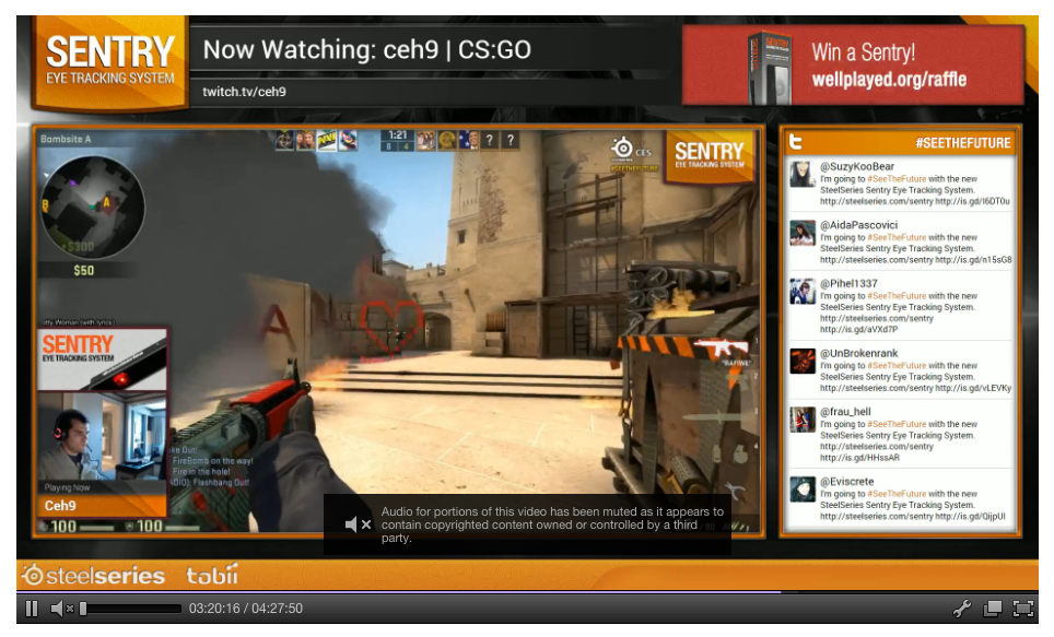
Recently, I had the pleasure of designing for the SteelSeries Sentry Streaming Overlay. The Sentry Streaming overlay is a software application that allows viewers to see where the user is looking when they play and stream their favorite games.
Since this was the first product of it’s kind at SteelSeries, there were many Design and Usability decisions to be made. Let’s go through the list and discuss how we went about addressing them.
1st Challenge: Helping lost souls
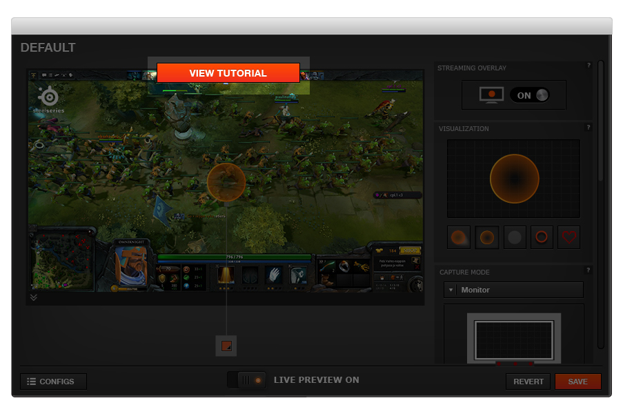
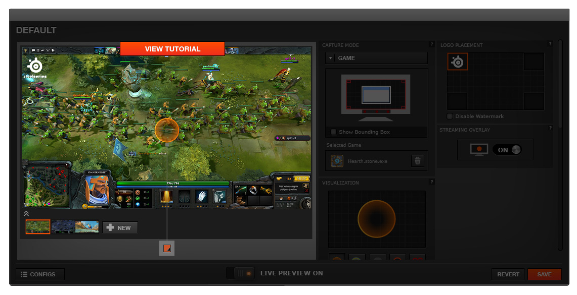
When a user first unboxes the Sentry device, there are a few steps they need to follow to set it up before they start configuring the overlay portion. With that in mind, we want a means of accessing a tutorial to be front and center, so that the user could easily get assistance if needed. Access to the tutorial needed to be highly visible, but not overwhelm the page.
Solution: We made the button bright orange and placed it in the center right above the main image. Anything in orange gets more visual weight on the page, and by making it the largest button, it ensures that it will be easily visible. Also, since the human eye reads from left to right, top to bottom, placing the button in the center would mean that the user would see the button and then move on to view the rest of the elements on the page. Thus, we achieve movement and it doesn’t overwhelm the rest of the elements.
2nd Challenge: Turn off the lights!
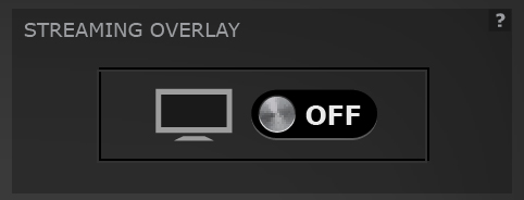
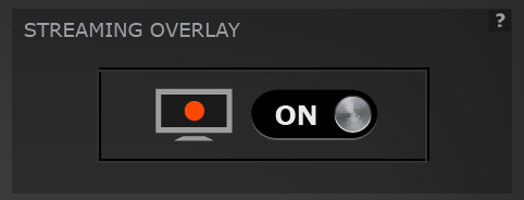
When the Sentry device is on, there are red lights and a visualization on the user’s monitor that follows their eye movement. We thought that there might be times when the user wants to disable this. Therefore, we need a way to turn on and off the overlay simply and quickly.
Solution: We made the first widget the Streaming Overlay Toggle. There is a nice, simple visual showing an empty monitor when the overlay is off and a bright orange dot when the overlay is toggled on. It also has prime real estate as the top widget, making it simple to use and quick to access.
3rd Challenge: So many options
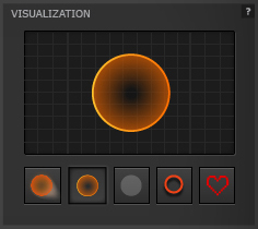
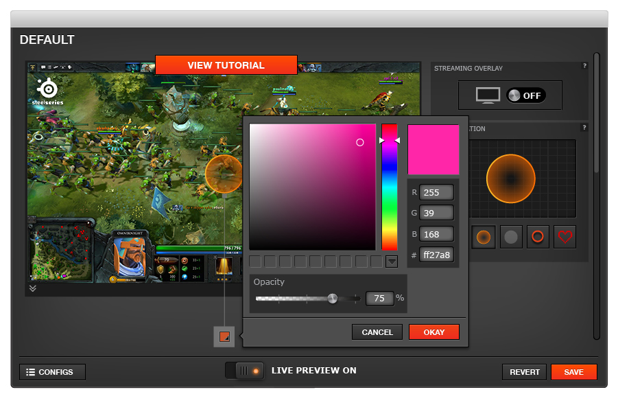
We want to give people flexibility around how they choose to visualize their gaze. In order to do this, we need to clearly show what visualization options are available and make them very easy to access. We also want the ability to change the color and transparency. On top of all of that, we need to clearly communicate which visualization is currently selected.
Solution: We created the Visualization widget and utilized the main area as a preview section. First, we had to decide how many visualization symbols there should be and what they should look like. We had internal discussions, hallway usability sessions and lots of sketches.
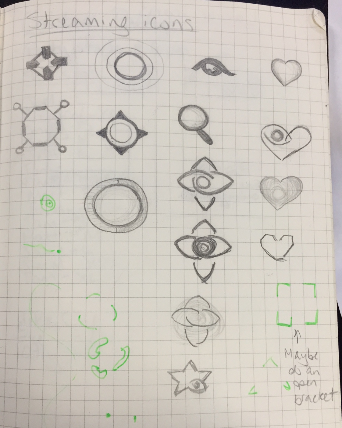
Eventually, we settled on 5 visualization symbols. Next, we started design on the widget itself. We needed a way to showcase the selected symbol without relying on a game screenshot. A grid pattern seemed to work nicely. Also, we did not want to rely on verbiage, so we made the symbols unique enough to see that they were all different when displayed at a small size.
In order to change the color and opacity of the selected symbol, we reused current functionality by adding the clickable color swatch. When the user clicks on it, they get a color picker and a transparency bar. We used the common practice of a checkbox pattern to illustrate which side was transparent to reduce confusion. When the user is done choosing their colors and transparency settings, the symbol on the main preview image updates accordingly.
4th Challenge: Capture it
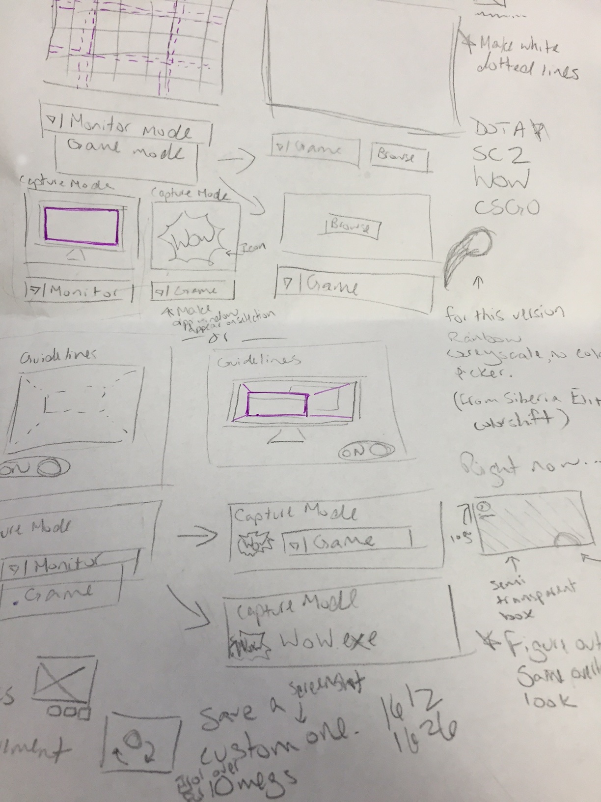
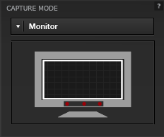
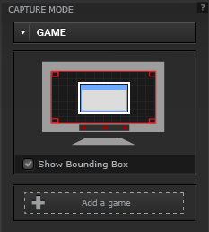
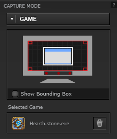
Through usability research, we have found that people have different levels of motivation when it comes to making new tech work. Some people just want to plug it in and go, while others take extra time to make sure everything is configured properly. With this knowledge, we arrived at the Capture mode widget. There are two ways to stream a game using the Sentry Streaming overlay. One mode will capture the user’s entire screen. The other mode will allow the user to choose a game so that only the game window will be broadcast. In short, we needed to give the user a simple capture mode by default, with the option of a more configurable capture mode.
Solution: For the default mode, we chose the simplest Monitor capture option. Again, we utilized a simple monitor image to illustrate the function. When the user selects the Game capture mode option in the drop down, the image changes. White guidelines appear on the monitor, with the checkbox to turn it on/off. There is also an Add a game button. When the user clicks on it, they can add a game exe with the option of deleting it. Using the game’sicon reminds the user which game they’ve selected.
5th Challenge: Branding
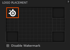
We wanted to include some SteelSeries branding during user’s streams, without being intrusive. It was an exciting opportunity to get exposure to a wider audience.
Solution: We created a Logo placement widget to give the user the option to change the location of the SteelSeries logo, or even turn it off completely. We preferred that the user doesn’t turn off the watermark completely, so the option is present in a subtle way by means of a checkbox.
6th Challenge: Bells and whistles
We wanted to add a couple additional features for finesse.
Solution: Whenever the user edits the visualization, it’ll update and move around the screen so that they can get a good sense of how it will look while streaming.
We also added the ability for the user to change the screenshot or upload their own in order to get a good preview.
7th Challenge: Not enough time!
Because of time restraints, we had to wait on certain features that provided additional functionality. One such item was being able to adjust the size of the visualization. We recognized that some users might want to make their symbol larger or smaller.
Another piece of functionality was being able to set up custom gradients, or allow the user to upload their own visualization symbols.
Solution: Since we were debuting the Overlay at CES, we saw an opportunity to observe streamers using the product. We were hoping to see if the users confirmed or dispelled our assumptions about current design decision and additional functionality.
We found that users kept switching between visualizations, which leads us to believe that they found the widget easy to use. They also changed the color and opacity often, so they seemed to be having fun with the feature.
One of the major feedback points was being able to make the visualizations bigger/smaller. It was nice confirmation that we should put that feature back in.
We also got validation on one of the visualizations that were a bit risky: the 8 bit heart icon. Users really responded well to it, with most of the streamers using it at some point during their stream. Headshot!