Software
Style Guide
Welcome to the SteelSeries UX Team Software Style Guide! This defines elements for the purposes of software and app development. If you are looking for guidelines on logo, font, or brand usage, check out the SteelSeries Brand Guidelines.
Colors
The Steel Series color palette consists of a foundation of five Primary colors, four secondary colors and nine Highlight colors. These colors were chosen based on the colors gleaned from the website and printed materials.
Orange
#ff5200
Brand orange
Used for positive actions
Light Gray
#a5a7aa
Default text color
Dark Gray
#4d4d4d
Background color
Darker Gray
#2d2d2d
Background color, text on light backgrounds
Almost Black
#1c1c1c
Used for borders, dark accents
Selected Blue
#0091d1
Used for selected items
Medium Gray
#666
Background color for inputs
Off white
#ededed
Used for brighter text treatments
White
#fff
Used for text on selected items, buttons, inputs
Highlight colors are used primarily for the advanced actions, creating a visual cue for complex categorization. These colors were chosen based on the need for a monochromatic color scale that conveyed similar yet different user actions.
Blue
#2f4f88
Aqua
#356e74
Light Blue
#2a7199
Dark Aqua
#1c4e57
Green
#2b683a
Maroon
#782e39
Clay
#b24736
Slate
#50648c
Plum
#6f3969
Gradients have be used for shading, creating highlights and shadows by changing value, and minor changes of saturation.
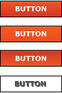
Primary Action Gradient
Default
#ff5200 to #cd3400
Hover
#f05d18 to #f0491d
Down
#cd3400 to #ff5200
Disabled
transparent
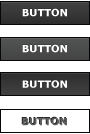
Secondary Action / Default Buttons
Default
#404040 to #2d2d2d
Hover
#535353 to #434343
Down
#2d2d2d to #404040
Disabled
transparent
Typography
Download Helvetica Neue LT W1G: https://steelseries.app.box.com/Fonts
Download Frucade Small: https://steelseries.box.com/s/jvx01uxu9i5m3enkwknd
Fonts
Verdana Regular
Verdana was chosen because it is a screen-friendly system font. Use everywhere (body copy, input fields, dropdowns) unless otherwise specified.
abcdefghijklmnopqrstuvwxyz
ABCDEFGHIJKLMNOPQRSTUVWXYZ
1234567890
Verdana Bold
Use Verdana Bold for headings. Always use this font in all caps.
abcdefghijklmnopqrstuvwxyz
ABCDEFGHIJKLMNOPQRSTUVWXYZ
1234567890
Helvetica Neue LT W1G
Condensed Bold
Helvetica Neue was chosen because it is widely used in printed materials. Use it for accent fonts.
ABCDEFGHIJKLMNOPQRSTUVWXYZ
1234567890
Helvetica Neue Bold
Helvetica Neue was chosen because it is widely used in printed materials. Use it for buttons.
ABCDEFGHIJKLMNOPQRSTUVWXYZ
1234567890
Frucade Small
Frucade Small was chosen because it was a font that looked crisp at a very tiny size. For use in widgets, and only for numbers.
Type Sizes
Form fields / Inputs
Variable x 22px

Variable x 22px

12px x 12px

12px x 12px

Variable width x 24px
Variable
Buttons
Min. width of 68px x 24px
Min. width of 68px x 24px
Min. width of 68px x 24px

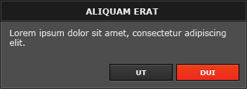
Modals
Variable Size
Drop Shadow/Inner Border
inset 0px 0px 1px 1px rgba(255, 255, 255, .1)
0px 6px 8px 0px rgba(0, 0, 0, 0.5)
Variable Size
Drop Shadow/Inner Border
inset 0px 0px 1px 1px rgba(255, 255, 255, 0.1)
0px 6px 8px 0px rgba(0, 0, 0, 0.5)
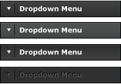
Common elements
8px x Variable

Variable size
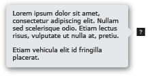
Min. width 101px x Variable
Drop Shadow
0px 6px 8px 0px rgba(0, 0, 0, 0.5)
Gear Tab
Variable x 33px

Min. width of 580px x 80px
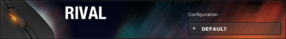
Library Tab
200px x 162px
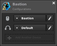
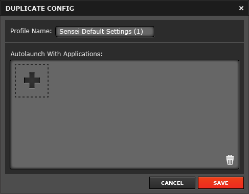
Config Window
200px x Variable
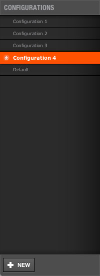
13px x 13px

Variable


Variable
230px x Variable
Variable

Window Sizes
Main Window
Default size: 656px x 430px
Config Window
Default size: 890px x 595px
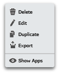
Icons
Icons are picked from the Iconic and Gentleface RT icon sets. Icons are chosen for their simplicity and aesthetic quality.
Download the full set of vectorized icons from Box. Update the file whenever you add a new icon here.
Icon Colors
Icons in Menus
 Default: Dark Gray #4d4d4d
 Disabled: Light Gray #a5a7aa
 Hover: White #fff
Quickset Icons
 Color: Black #000
Dark Background
 Color: Light Gray #a5a7aa
Bright Backgrounds
 Color: White #fff
Use the SteelSeries PowerPoint template for all presentations.
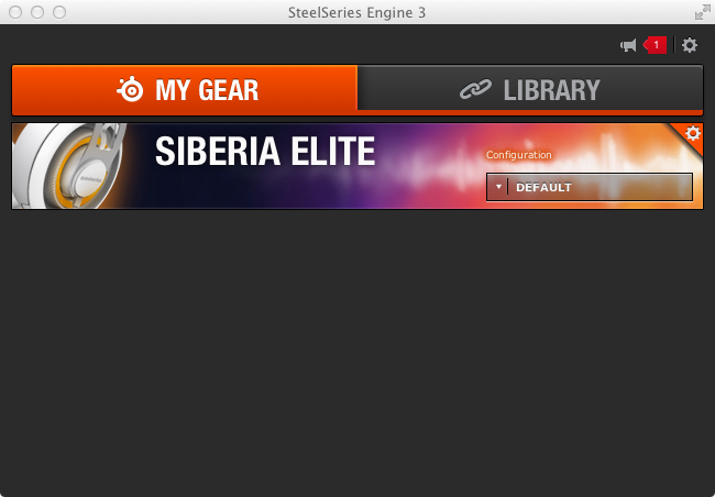
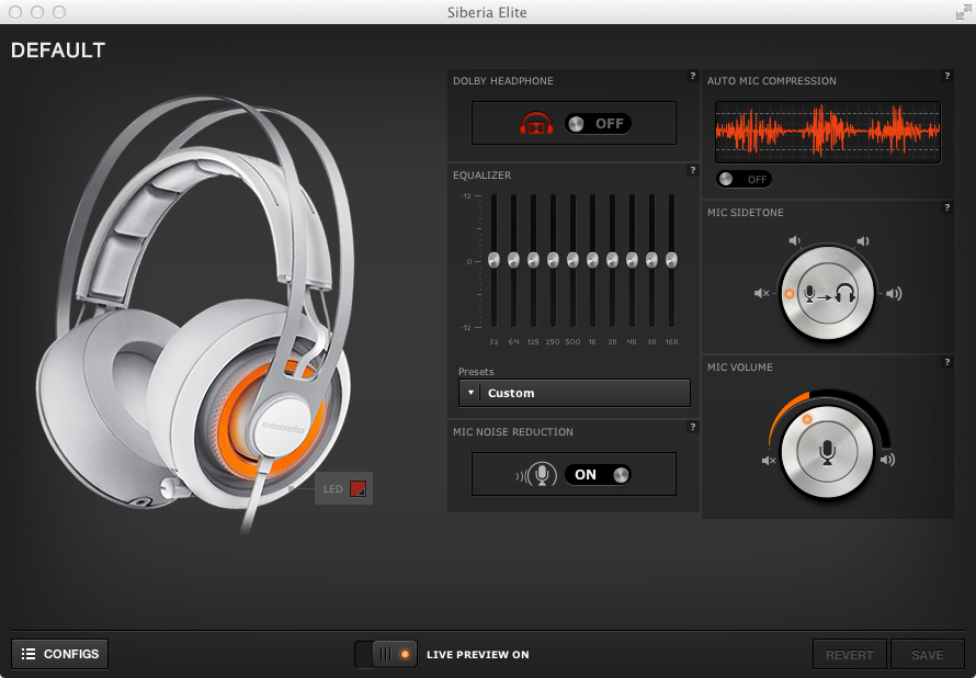
Screenshots of SteelSeries Engine 3 can be found on Box. The folder includes high resolution screenshots for print and lower resolution screenshots for web, as well as all icons used in the software.